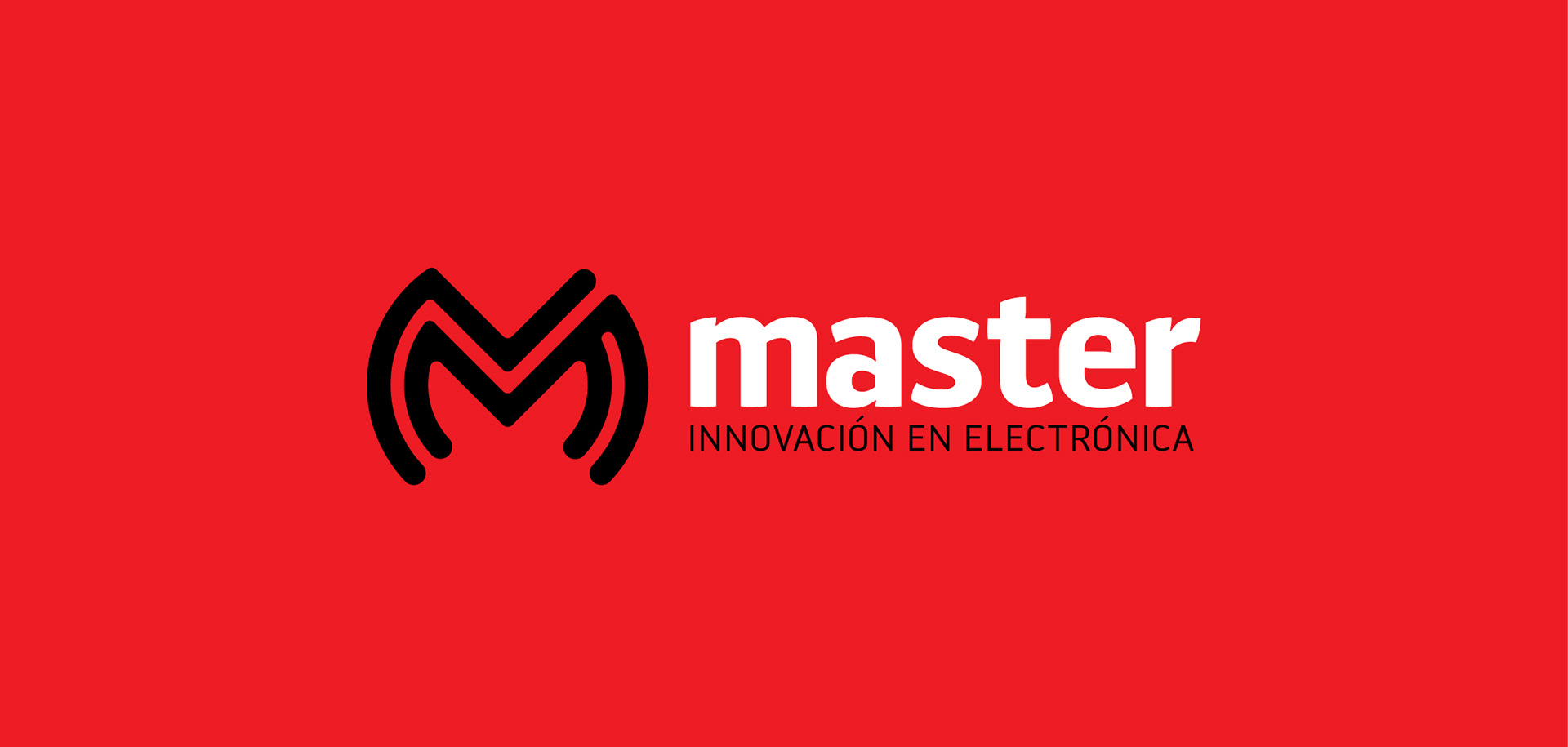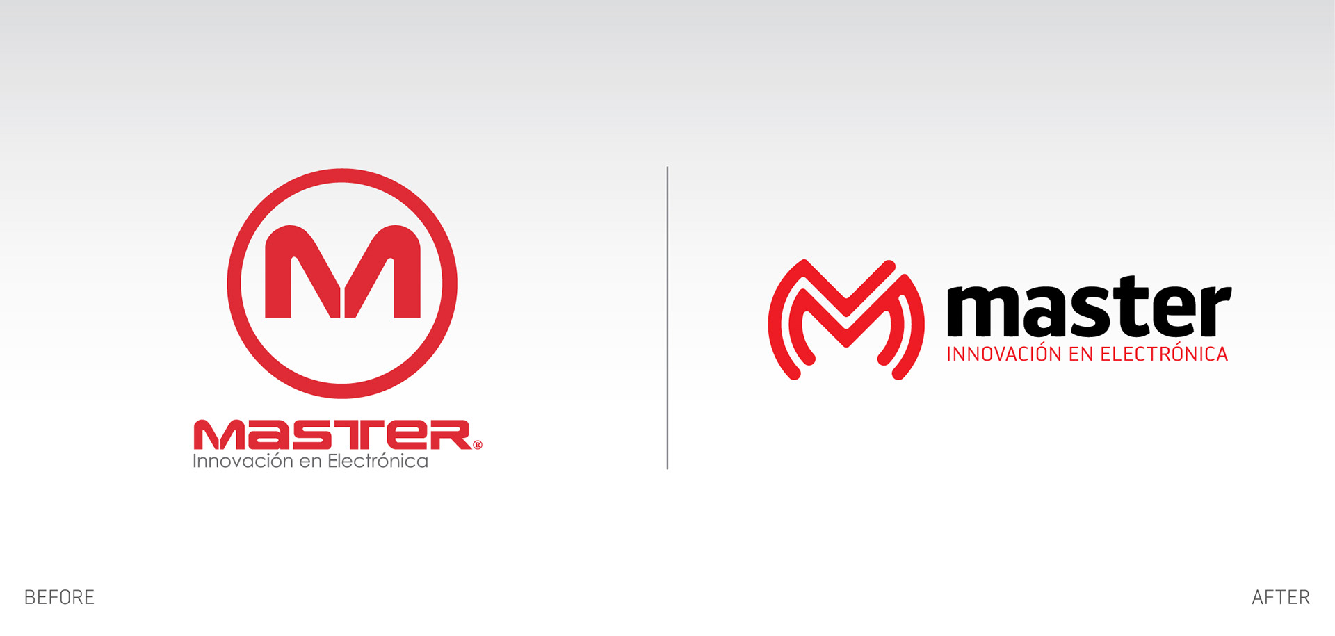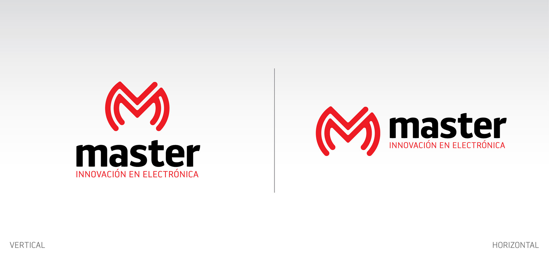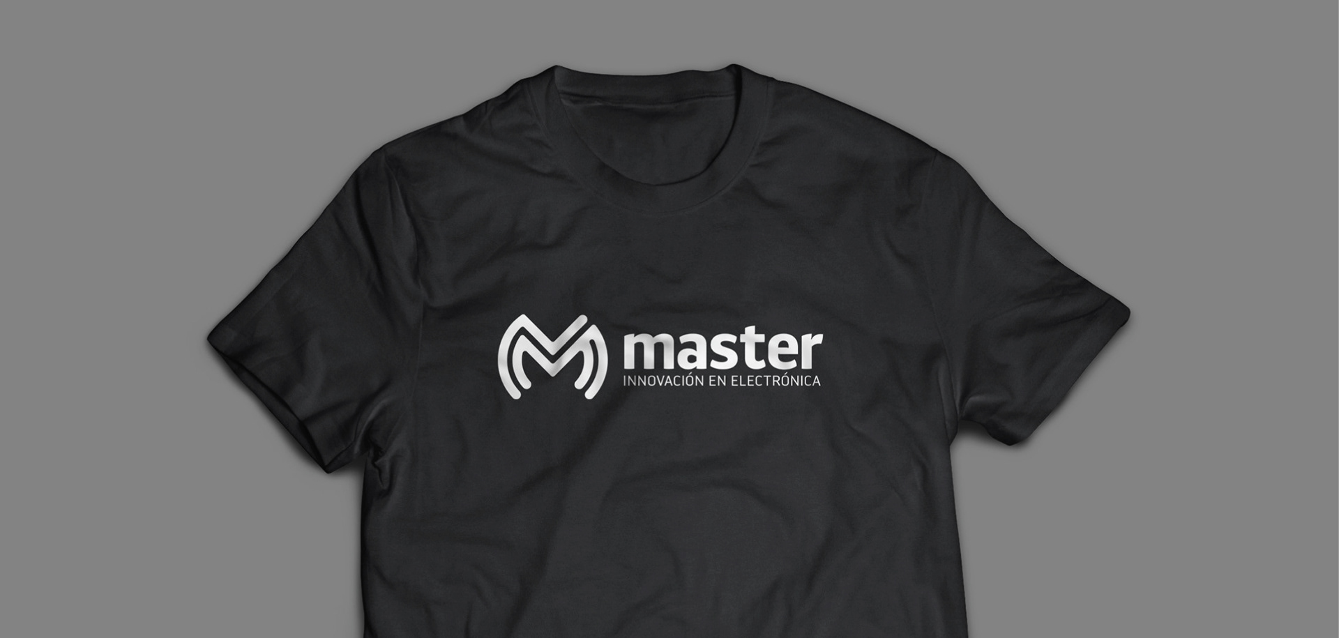
Master, a company focused on developing electronic products of the highest quality, embarks on a search for reflecting greater innovation in its identity.
Its new graphic identity was developed thinking in a symbol which represented the “M” letter, connecting the products we sell with the end user. At the same time, showing they are professionals and with highly innovative products.
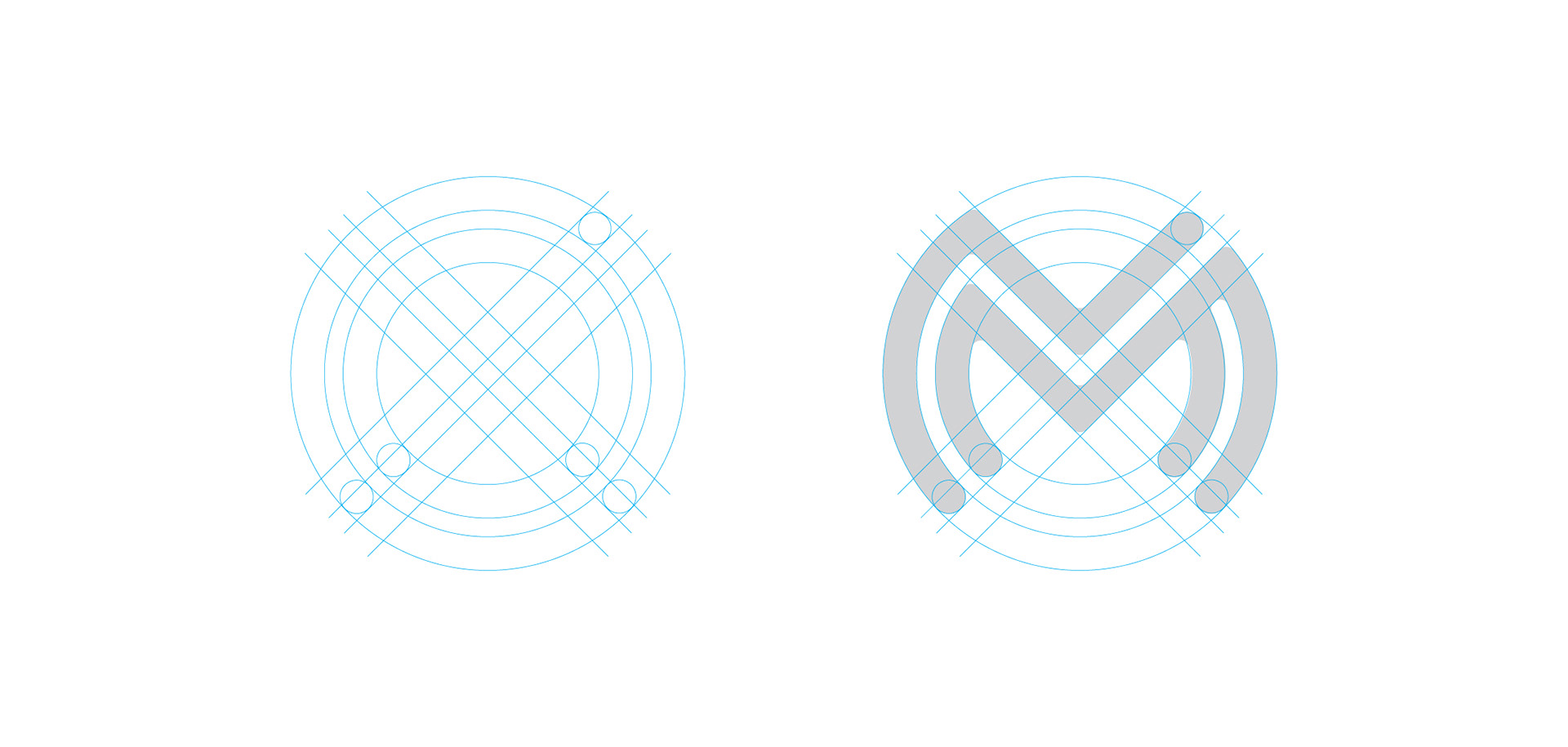
This way, inspired in airway connectivity, I did my strokes focused on radio waves, thus detonating this connectivity and integrating the “M” in this system.
The strokes are rounded in order to avoid an aggressive identity, searching for a friendly, smooth and modern representation, in accordance with the service provided in the stores, a friendly service, reaching for total client satisfaction.
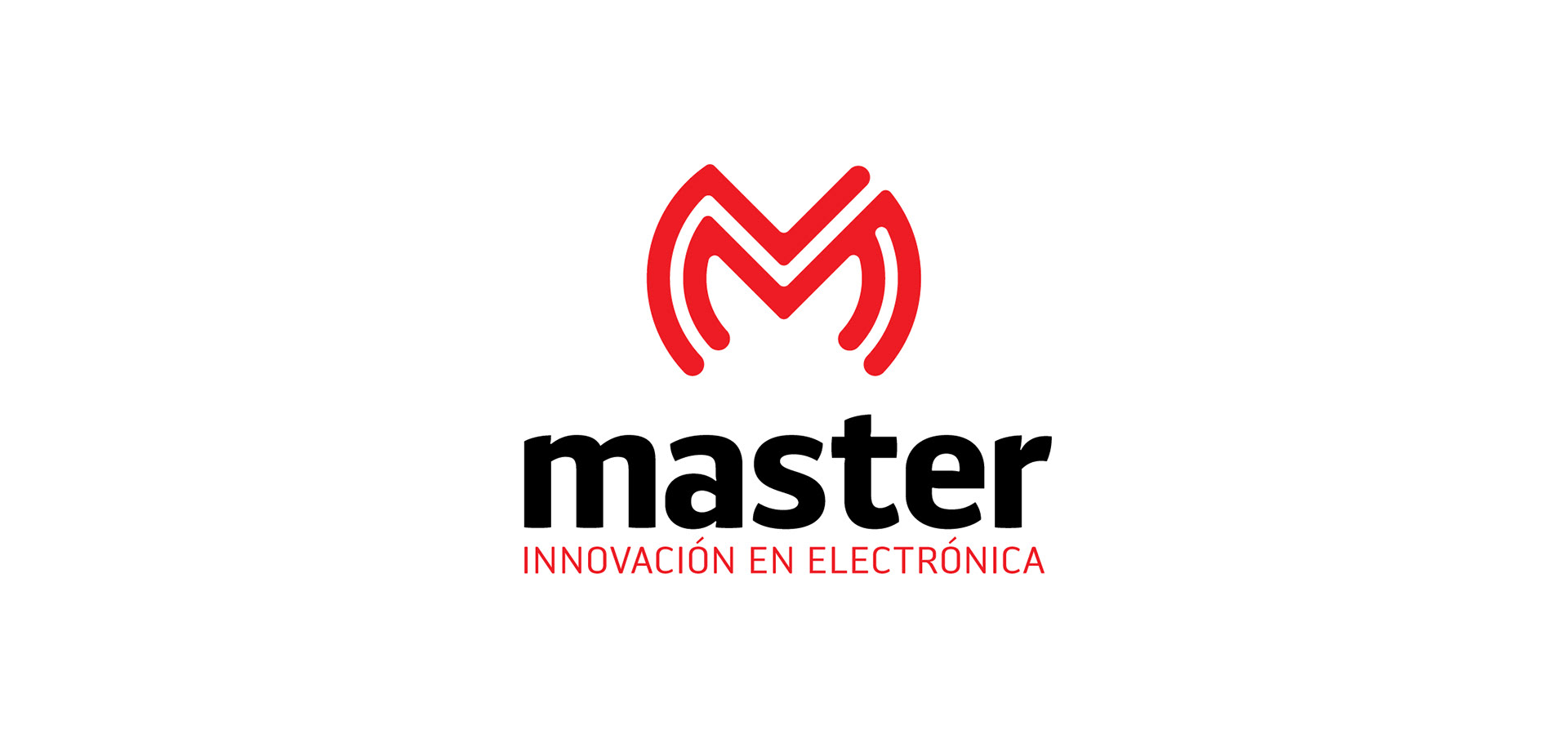
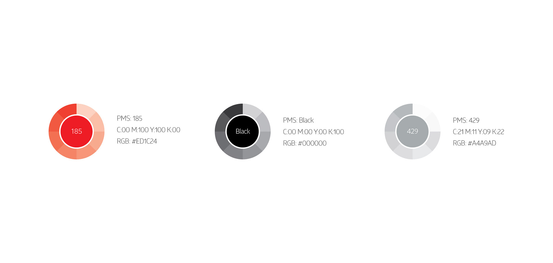
In the results showed by the studies of the brand, colors were on of the primary triggers of remembrance amongst clients, therefore, I decided to keep the original color palette. I just added a neutral color for detail.